


2013
May
11
HTML and CSS for E-book Self-Publishers, Part 3: CSS
This is it, the one I was worried about writing: style sheets. As a reminder, the XHTML we talked about in Part 2 describes the structure and content of your material and CSS describes how it is presented. I was worried for a couple of reasons, and as I got into writing this installment, I found my fears justified.
First off, let me explain that I am using the term CSS rather loosely. In fact, the style sheets used in EPUB documents are compatible with CSS, use the same syntax, and many of the same features. I learned CSS through web development, and when I first experimented with formatting e-books, I ran into some issues. For example, when I tried to use what is called the first-word pseudo-element, it just plain didn't work. EPUB style sheets support a subset of "real" CSS, and it is not always clear what that subset is. The problem is exacerbated by the fact that e-reader designers are given some leeway in how to implement the standards. If you want to zero in on the details, the description of style sheets for EPUB 2.0 is given here. Note that I may still say CSS, though somewhat inaccurately. Please bear with me.
The second issue is that even though we are talking about a subset, there are still dozens of properties, dozens meaning well over 100. Just a few of them:
text-variantmargin-right
color
border-bottom
cue-after
The good news is that you can defeat most formatting challenges with relatively few of them. The bad news is that it takes a while to learn how they all fit together. You might in your mind know want you something to look like, and pull out half of your hair trying to get CSS to adhere to your vision. Oh, the properties do what they're supposed to; it's putting them together in the right combinations that takes some figuring out. Unless you are a divine being you will get frustrated. This is why you still might want to hire a professional for fancy stuff, but bear in mind that professionals get frustrated, too.
So, with these two apocalyptic details under consideration, I decided to shift the focus of this installment away from comprehensively explaining style sheets, because I can't do it in one post. Maybe 20. Instead, I decided to simply explain enough that you can understand what you are seeing and how it all works, and to be able to interpret the examples when I get to them. If you want to develop your e-book formatting skills, you'll just have to bit the bullet and get yourself a book on it.
What "Cascading" Means
You should know this. There are four sources that a browser or e-reader can get style information, and they are prioritized so that higher priority sources override lower priority sources. The four are:
- Browser or e-reader internal styles. They all have these, or they wouldn't be able to display simple pages that don't include any explicit style information.
- Styles contained in external style sheets. Anything here overrides the default styles. Note that you can have more than one style sheet.
- Styles defined in the head section of your page. Yes, there is a <style> element that I didn't mention in the last installment. I left it out for 3 reasons: (1) We hadn't even gotten to styles yet, (2) they apply only to that page and writers usually want the same style across the entire book; and (3) there was no sense in explaining something you would probably never use.
- Styles declared in the style attribute in a start tag.
Now, when I said that higher-priority definitions override lower-priority ones, it is important to understand that the override applies to specific properties (like font-weight: bold;) and not to the entire class. I demonstrated this in Part 2 with my uglylred class example. The attribute style="color: blue;" overrode only the color, not the entire definition.
CSS Structure
As I said last time, CSS groups properties into classes. A typical class might look like this:
p {
    font-family: Arial, Helvetica, sans-serif;
    font-size: 10pt;
    color: black;
    padding: 8pt 2pt 0 2pt;
    text-indent: 2.2em;
}
What we have here is some kind of identifying selector, followed by a pair of curly braces that wrap a list of properties and their values. The properties are separated by semicolons. You don't technically need a semicolon on the last one, but always put one there anyway or you will end up adding another property to the end, forget the semicolon, and then be frustrated when things don't work anymore. The format of this declaration doesn't matter, but if you want to save yourself headaches, you'll write it as I did above, or something similar. It'll work fine like this:
p{font-family:Arial,Helvetica,sans-serif;font-size:10pt;color:black;padding:8pt 2pt 0 2pt;
    text-indent:2.2em;}
But you'll hate yourself later when you have to go back and figure out what's wrong.
About selectors
In the example above, the p at the front is the selector. In the real world, selectors can take three forms:
- HTML Tag
When the selector is just a letter or sequence of letters, it represents an HTML tag, and is to be applied to all elements of that type. In this example, the class is applied to all paragraphs.
- Class name
When the selector is written in the form "*.name" or just ".name", then any element with its class attribute set to that name (i.e. class="name") will have that style applied to it.
- Identifier
When the selector is written in the form "#name", then it is applied only to the single element that has that identifier, such as id="name".
That is the basics of selectors, but there are a couple of other facts that you might find useful:
- You can get more specific. The selector p.indent, will apply that class only to paragraphs with the attribute class="indent".
- You might be able to save space by writing multiple selectors on the same line, separated by commas. For example, h1, .h1, #h1 will apply that style to all h1 headers, all elements with class="h1", and the element with the id h1.
Now I need to tell you once again that I am just scratching the surface of selector syntax.
About properties, In general
As you can see above, properties take the general form:
property-name: property-value;
However, there are some subtleties in the property value syntax. You may have multiple values separated by spaces as in:
padding: 8pt 2pt 0 2pt;
Here, all the values apply, and it is usually important what order they come in. In this example, the four values represent the top, right, bottom, and left. You just have to learn these, but there is another way to do it so that you don't, and I'll show you about that later.
Or, you may see values separated by commas:
font-family: "Gill Sans", Arial, Helvetica, sans-serif;
In this case, the values are interpreted one at a time, and the first one the browser understands is the one it uses. If it can't find "Gill Sans", it will look for Arial, and if it can't find that, Helvetica, and so on. sans-serif is one of several typefaces always defined. I always put one of those at the end, but if it can't find any of them, it will use the default.
About properties, more specifically
There are often multiple ways to define values, giving you a choice. I'll point out three of them here.
- Sizes
If you look at my paragraph example way at the top, you'll see that I defined padding and text-size in points, and the indent in ems. You may also use px for pixels or cm for centimeters, but I've never used centimeters. In the case of fonts, you can also specify size in terms as a percentage of the size used by the parent element (75%, for example), or with vague terms such as small, xx-large, and larger. I avoid those.
- Colors
Here is where my British friends will have to take one for the team and spell it color. I suppose the properties were defined in America. As with size, color can be specified several ways. Note that although you can specify all of these colors, e-readers are not required to reproduce them.
- There are 147 pre-defined color names, which are what most people probably use most commonly (entirely speculative). Rather than try to list them here is a link.
- If you are a graphic artist, you can specify them with a hexadecimal RGB value such as #228AFF, where the first two digits are red, the second two are green, and the third are blue. I use this method fairly often. If you are not a graphics artist and don't know what I'm talking about, just skip it and use the pre-defined names.
- If you are even more of a graphic artist, you can specify colors as RGB, RGBA, HSI or HSIA. I'll not explain these as to not overload, but details are here.
- Position
Often, it is necessary to specify where within a page, or more generally, within any parent element, where an element should be positioned. As with size, you can specify position in points, ems, pixels, etc., but there are also special keywords like top, right, and center.
- URLs
Often, it is necessary to specify the location of another file, almost always an image such a background. that uses the notation url(<path to file>). Notice that the file path is not enclosed in quotes.
Display element sizing
Everything you see on a page occupies a rectangle. This is true even if the content isn't rectangular. Understanding how this works is crucial to any kind of formatting. In a nutshell, your content is surrounded by padding, which is surrounded by a border, which is surrounded by a margin. Think of it as a set of boxes within boxes.
I was all set to pull out CorelDraw and make an elegant diagram to demonstrate, but realized that such diagrams were already scattered about the Internet, and many of them with more detailed descriptions than I would put here. One that looked suitable is:
http://coding.smashingmagazine.com/2009/10/05/mastering-css-coding-getting-started/
The part about sizing is followed by floats, which I don't intend to get into, and then some other stuff. You're free to read all that if you want, but it's optional.
However, there are some important points that web page mentions, but not so prominently, and they are such that if you don't get them right it may drive you to the madhouse. I'll try to make sure both points are clear:
- In an Inigo Montoya moment, the properties padding and margin might not mean what you think they mean. Padding is the space inside the bounding container, and margin the space outside. I've been doing this for more than 10 years, and it still seems like they are backwards.
- The width property is the width of the content, not the container. This seems rather like measuring a sheet of paper by the size taken up by the paragraphs on it.
Together, these two curiosities conspire to make life difficult. Suppose you create a box of a certain width and put some text in it:
 You decide the text is too close to the border and want it to look like this:
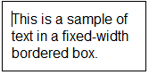 Your first thought might be to increase the margins as you would in a word processor. You'd be wrong. That would give you something totally different. What you need to do is increase the padding, and then, since that would make the whole box wider, decrease the width of the text by a corresponding amount.
I know. It's crazy, and sometimes leads to a lot of extra work. This is precisely what leads me to speculate that the specification was developed under the influence of mental deficiency, malicious intent, alcohol, or some combination of those three.
Different ways to say the same thing
Of course there has to be a complication like this, but this one turns out to be mighty useful.
You can write:
p {
    padding-top: 0.8em;
    padding-right: 0.3em;
    padding-bottom: 0;
    paddling-left: 1.2em;
}
Or, you can write it more compactly as:
p {
    padding: 0.8em 0.3em 0 1.2em;
}
Likewise, you could write:
p {
    font-family: Arial, sans-serif;
    font-size: 12px;
    font-weight: bold;
}
Or:
p {
    font: bold 12px Arial, sans-serif;
}
Notice that in the second example, I changed the order of the properties. This is because when you write them the long way, the order doesn't matter, but in the compact form, it does. If the parser finds something out of order it will just stop there, and make you wonder why some of the properties work and some don't. You may also see some even shorter notation, such as
p {
    padding: 0;
}
which means that zero is applied to all four sides. There are other shorthand notations, but again, they're one of those things that you just have to learn by brute force if you don't want to look them up every time.
A word about files
It is likely that you will need only one CSS file, typically names something creative like "styles.css." Actually, you can name it anything you want as long as the XHTML file that uses it points to it correctly. But as you get used to how style sheets work, you might find it convenient to breaking them up into smaller files, each of which addresses specific needs.
The cool thing is that you can reuse them. Let's say that you have a series of 27 books (I know; that would be a long series). Once you get the style just the way you want it in the first one, you can export that file sheet to a regular disk file, then import it into the other 26 books. The whole series will match without having to do that work over again.
So, this seems to me to be all you need to know to follow the examples that come later and to at least make some sense out of style sheets when you come upon them. It might turn out that I am totally wrong about that, in which case I will amend this post further. Or, it might turn out that you discover I am totally wrong, in which case please leave comments and I'll try to answer them or amend this post.
I'll be honest with you. When I got into this style sheet installment, I began to think that I bit off more than I can chew. I was tempted to forget about it and simply post an add saying that I am available for hire to do all this for you. However, I do have faith in people's persistence and hope that you are willing to jump in and give it a try. I have only touched the surface of style sheets, but this should be enough to meet most basic formatting needs.
Wait for the examples in Part 5 and see how it all is put together.
Good luck!


Comments
There are no comments for this post.
You must be logged in to post a comment.