


2013
Jun
21
HTML and CSS for E-book Self-Publishers, Part 5: Some Examples
First of all, let me apologize for the delay in getting Part 5 up. I was under the weather for a while and not motivated to think technically, but things are better now.
This is where I show you how to do some cool effects. This is also where I show you come cool effects, you can't really do. "Aw," you say. Well, don't blame me. Blame the e-reader manufacturers. Now, if you create a fancy e-book and check it in Sigil or Calibre, it'll probably work. That is because both Sigil and Calibre use the Qt rendering engine to render e-books, and Qt is a full-featured web browser toolkit. (Look here if you're really that interested.) The problem comes with the e-readers. I don't know how the history went down. It could be the the original e-book formats were short-sighted. It could be that e-reader developers were lazy. It could be that e-reader manufacturers wanted proprietary (meaning incompatible) formats. Who knows? But the bottom line is that every e-reader renders differently, and some things don't get rendered at all.
They could have made it easy and just specified, "Fully support HTML 5 and CSS 2." Then, whatever you wrote would work anywhere.
But they didn't.
To make matters worse, you really can't count on previewers. Amazon leads the pack in this regard and offers a downloadable previewer for seeing how things look on different devices. The problem is, it doesn't work. Things render perfectly well on my real live Kindle e-ink that don't work on the previewer. Amazon and other manufacturers also have downloadable readers, but you can't count on those for testing, either, because, like Sigil and Calibre, they're built on existing web rendering engines — I wouldn't be surprised if they're all Qt — so things will look perfect there and still not work right on the corresponding e-reader.
Sigh.
So how do you protect yourself? You can buy every possible e-reader and actually test them all, or you can keep things fairly simple, adhering to the lowest common denominator, and wait until the e-readers catch up with the 21st century. I'll be focusing a lot on the second strategy.
Throughout this installment, remember the basic box model that was introduced in Part 4. Everything renders as a rectangle, with padding (space on the inside), margin (space on the outside), a border, and a background. That doesn't sound like much, but as you are a writer to begin with, you are a creative person and can use the creativity to do what you want. Remember, your computer monitor can reproduce any of the great paintings, and some not so great, with just red, green, and blue.
I should mention that as of the time I am writing this, I am offering free e-book production in exchange for a credit. So if you don't want to bother with this yourself, pop me an e-mail. I don't know how long this offer will last.
So, lets get started.
Decorative Divider
I'm starting here because it's the simplest effect and should work anywhere. By default, there is a horizontal rule that looks like this:
The HTML code is simply:
<hr/>
However, some time ago I posted on image on Twitter that showed a divider that looks like this:
Sure beats those three asterisks in the center, doesn't it?
As it turns out, the HTML stays the same and we use CSS to tell the e-reader what it is supposed to look like.
hr {
  background-image: url(../Images/divider2.png);
  background-position: center;
  background-repeat: no-repeat;
  height: 10px;
  clear: both;
  border: none;
}
For this one, I'll describe everything that goes into that style, but later on, I'm sure I'll give some abbreviated descriptions. Here goes.
The hr says that this style applies to all horizontal rules.
background-image points to the image file that we use. Remember from Part 4 that the path is relative to the location of the HTML file that uses it.
background-position tells where to put the image, and in this case we want it in the center. We only really care about horizontal positioning, but this attribute can also specify vertical positioning.
background-repeat is necessary because by default the renderer tiles the image to fill the entire element, and we want it to appear only once.
height: the size of the background image says nothing about the size of the element, so we have to give it some height. By default, a horizontal rule is 0 pixels high, not very useful. Self test: The 10 pixels I specify here is the image height, but contributes to the visual spacing above and below the divider in addition to any paragraph spacing. It is a constant 10 pixels. Would it make better since to specify it in points so that it changes with font size? In that case, you would also have to center the background vertically. Or make the height identical to the image size and give top and bottom margins in points? Think about what would work best.
border: By default, that single line of the horizontal rule is created by a narrow border around a zero-height box. Unless you want your divider to be in a visible box, you have to turn it off.
clear: Oh, no, I didn't intend to skip this one. It addresses a layout issue that I haven't brought up, and probably isn't even necessary here, but I put it in as insurance. clear: both; tells the renderer not to put anything to the left or right of the element. There is more on this below
OK, take a breather before we move on. I am.
Fancy Chapter Heading
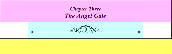
Back in Part 1, I showed a chapter heading that looked like this:

This is where we get into something that doesn't work. My original intent was for the HTML to be:
<h2>Chapter Three<br/>The Angel Gate</h2>
i.e., a simple header with a line break. It didn't work because I was using what is called a pseudo-element, in this case first-line, where one would create a style that tells the reader to treat the first line differently, such as smaller. But alas! No pseudo-elements. So I was forced into what I consider a hack:
<h2><span class="chapter">Chapter Three</span><br/>The Angel Gate</h2>
The span tags are here to tell the e-reader explicitly to treat the first line differently, because it doesn't have the sense to figure out on its own what the first line is.
The accompanying CSS is:
h2 {
  text-align: center;
  padding-bottom: 40px;
  margin-bottom: 3.5em;
  font-family: "Times New Roman",Georgia,Serif;
  font-size: 1.4em;
  font-style: italic;
  background-image: url('../Images/divider1.jpg');
  background-repeat: no-repeat;
  background-position: center bottom;
}

.chapter {
  font-size: 80%;
}
Now to explain all of this, I thought another image might be useful to show how the visual elements go together.
Here, I've used color coding, obviously, to mark out various components. The area with the black border is the actual area of the element, in this case h2, a header element. The yellow area is the bottom margin. The pink area is the space occupied by the content of the element. , i.e., the text between the <h2> and </h2> tags. The blue is the space taken up by the background image. With that under our belts, let's take another look at the CSS.
Note that padding-bottom is in pixels and margin-bottom is in ems. Remember from before, pixels are a fixed size, in this case to leave room for the graphic, and ems are in terms of font size. We want the margin below to change with font size, which is generally the more aesthetic way to go. Also note that there is no explicit height attribute here, as we want the height to vary with font size. It could be specified in ems, also, but that is a little more complicated and why bother if we can let the e-reader calculate it automatically?
Notice that the font size is also specified in ems. Those of you keeping track might wonder what the heck that means, since ems are in units of font size, and how can you set a font size based on the font size? Well, it's 1.4 ems of the font size that is in effect at the time it finds this declaration, in other words, in this case, the e-reader's default font size, which the reader can change. That way, when the text font size changes, so does the title font size.
The span that sets the font size of the first line is set at 80%, which is 80% of the font size already in effect, which is the main title font size. Follow that? I hope so. This could also have been in ems, or the main title font size in percent; it's all a matter of how you want to do it.
This only leaves the image. We tell the e-reader what it is the same way we did with the divider, but we want to center it at the bottom of the element rectangle so that it will be below the text. Notice that since this is a background image, it can actually overlap the text, if you want to do something more elegant. I guess that would be sort of a purple on this graphic. You can see where I did exactly this for my novel The Lastchild. Notice how the "leaves" on either side wrap around the chapter number.

You can see this in context, as well as couple of other chapter heading designs at one of my Fiverr gigs.
Warning Paragraph Style
It's not likely that you'll need a warning block for fiction, except perhaps to to prepare the reader for the shocking scene that follows, but you see this sort of thing in non-fiction all the time:

The HTML is:
<p class="warning">If you get this far, you need to know that there are some old,unnamed and dangerous things lurking in that graveyard. Beware! Check behind every
tombstone, under every corpse, and deep inside yourself. You don't know what lurks
there, either.</p>
Note first that we use a paragraph element (it is a paragraph, after all) but we assign a class name. We can't go redefining the generic paragraph because that would make every paragraph look like this, and that's probably not what you want. The corresponding CSS is
.warning {
  background-color: #FFFFCC;
  background-image: url(../Images/warning.png);
  background-position: 15px 10px;
  background-repeat: no-repeat;
  padding: 1em 1em 1em 75px;
  border: 1px solid #CCCCCC;
  font-style: italic;
}
I am using a bare class name as the selector (.warning) so that I can apply this style to any type of element I want. If it had been p.warning, then I could only apply it to paragraphs. Decisions like this will be part of your e-book layout planning.
This class has both a background color and a background image. You can do that without a problem. Here, the background image is just the little warning sign in the upper left-hand corner. The positioning is in pixels, 15 in from the left and 10 down from the top. Since it overlays the background and since all images are rectangles, you need an image that is transparent anyplace that you want the background color to show through. GIF and PNG images allow for transparencies; JPEG does not.
Now look at the padding. You'll see that three of the values are in ems and one in pixels. When you give padding like this, the order is top, right, bottom, left, so it is the left margin (padding; it's backwards, remember) is a fixed size so that the fixed-size image will remain centered in it horizontally. The other ones will change with font size to give a more balanced look.
The border attribute should be self explanatory. I have specified colors in hexadecimal format (see Part 3) because I'm used to it and it will give you any color you want, but you can still use any of the color names.
Drop Cap
Here is where I get to the things you can't do. "But wait!" you say, "Didn't you do this beautiful drop cap in Part 1?"

Well, yes, I did. And on that reader, it works perfectly. The font remains lined up with the top edge of the "B" as it changes size, and it all wraps just like it is supposed to. But the key phrase here is on that reader. The reader in question was Sigil (because I needed something I could actually capture an image of) and as I mentioned at the beginning, Sigil uses a "real" rendering engine which renders it correctly. Actual e-readers might place the cap too high or too low, change the alignment with font size, or other horrors. Some don't even render images at all, so you might start wondering who "ekka" is.
Yes, this is a horrifying state of affairs, and one that should be a source of public humiliation to anyone claiming to manufacture an e-reader. With the shoddy and hit-and-miss implementation of EPUB 2, I shudder to thing about EPUB 3. Presumably, all of this will be fixed eventually, but until it is, we have to play with the hand we are given.
Still, there are some useful things to be learned, so let's take a look. The HTML is:
<span class="dropcap-b"/>

<p class="first">ekka, still barefoot, slid to a stop on the chilly flagstone
just inside the open main gate. The breeze — more than a breeze, really —
coerced her hair and gown into an urgent flutter around her. She stared gaping
into the courtyard. Something had just happened, something mysterious, something
dark and dangerous. As if sensing her hesitation, one final gust extinguished
both torches in the castle's entryway, blowing soot into her eyes. The elders
would have to know about this!</p>
The span element implements the drop cap. Notice that I used the condensed form with the slash at the end so that this is both the starting and ending tag. If this sounds funny, go back and review Part 2 again. This is a good place to put in a warning. By default, Sigil is set to "clean up" HTML when you save the file, and if it sees this, it might just strip the whole span element and therefore your drop cap right out of the document. Why? It assumes that there is no point in a empty span and that you're wasting space. Well, those prettifiers aren't as smart as they think they are. I have that feature turned off, but if you want to leave it on and protect yourself, you could have this instead:
<span class="dropcap-b"> <span/>
The cleaner sees the non-break space as content (a regular space won't work because it's not technically content by itself) and leaves the tags in place. Just something to watch out for.
The following paragraph has a class identifier because the first paragraph has to behave slightly differently, as we will see shortly.
Here is the CSS:
.dropcap-b {
  float: left;
  clear: left;
  width: 71px;
  height: 74px;
  margin-top: -11px;
  margin-right: 0.3em;
  background-image: url(../Images/drop-cap-b.jpg);
}

p.first {
  margin-top: -.22em;
}
First, the dropcap-b blass. You already know all about the background image, which in this case is the graphic of the letter "B". I didn't say a thing about background image position or repeat because I have specified the height and width to exactly match the image size, so those won't make any difference anyway.
The float attribute is something you should know about, as it comes in very handy anytime you have images, but it has other uses as well. Basically, it means to put the element as far left or right as it can and let other elements flow around it, which is exactly what we want for a drop cap. The clear: left, means not to put anything to left of that element, which isn't really necessary here; habits die hard.
The margin-right value I'm sure you can figure out; you have to leave some space between the graphic and the next letter. But what the heck is that margin-top: -11px; in the dropcap class and the margin-top: -.22em; in the p.first class all about? Negative margins? Yes, indeed! To understand what that is all about, let's see how things might look if they weren't in there.

You'll see that the top of the letters in the paragraph no longer line up with the top edge of the "B." This is because block-level elements (like paragraphs) are positioned from the top down, so the e-reader will line the top of the text with the top of the image, not with the horizontal stroke. If you look even closer, you'll see that even that is not obvious and that the top of the letters don't quite line up with the top of the image. This is related to why the text seems to shift up and down as you change font size. The top of the letter isn't at the same height as the top of the text; there is a little space in there, and that space changes with font size.
Sigh. It's getting complicated just lining two things up, but since I did it, it must be possible. Let's try to reason this out. First, we have to lower the text from the top of the image to the top horizontal stroke on the "B," in this case 11 pixels. Then, we want to raise them again by some variable about so that the tops of the letters actually line up with that stroke, in this case 0.22 ems. OK, maybe that wasn't so difficult.
The problem is, you can't lower the text by 11 pixels and raise it by 0.22 ems. That would look something like
margin-top: 11px - 0.22 em
and there is just no such syntax. You can use pixels or ems or points or centimeters, but you can't mix them. So on to what I did. I raised the image by 11px, and then raised the text by 0.22em, which is almost the same thing, except you have to make sure that there is enough space above them to do this. Or, you could lower the image by 0.22em and raise the text by 11px. Same thing without the the above constraint.
The point of all these headache factors surrounding drop caps (which are impractical anyway) is to try to get you thinking about the sort of details that often come up in e-book layout. Hope it helps.
Leading Image
I got this idea, actually, from something similar in a print edition of Alice's Adventures in Wonderland.

I present it here as something cool that you can't do. Yeah, yeah, yeah! I hear you. "But you did it!" Yes, I did it for the Sigil renderer, and for a given font size. With something as simple as changing font size, it gets really, really messy really really quickly. Such are the advantages of print, where everything is fixed and you can make it however you want.
Such is also an advantage of a complete renderer that allows you to make it almost however you want. Even so, the changing font size was an issue and there are some features that I think are horribly absent from CSS 2.0. When you put something like this into a e-reader where the manufacturer has decided to leave capabilities out, well, forget it.
So this is a tease, so that you'll write to your favorite e-reader people and demand full support of HTML 5 and CSS 2. It's a moral imperative!
I hope this all has been a help to somebody at least.


Comments
There are no comments for this post.
You must be logged in to post a comment.